top of page
LISA ORYE
Branding & Design


Environmental Design: Johns Hopkins University (Baltimore & D.C. campuses) | Creative Direction, Concept Development, Hand-Painted Illustration, Site Mapping, Cross-Departmental Coordination, Environmental Graphic Design, Large Format Print Design, Brand Design System, Print Production Design, Pattern Design
Hand-painted ink feather textures inspired by the Blue Jay, developed into a four-banner series for Hopkins' Blue Zone identity. What started on Charles Street and San Martin Drive has since grown into a full environmental graphics system — from electric buses to campus signage — giving the university a lasting, ownable visual language. I later carried the feather textures over to light pole banners at Hopkins' D.C. campus, adapting the system to feature messaging specific to that location.
Click to read the recap.


Wayfinding Maps: Johns Hopkins University (Johns Hopkins Facilities & Real Estate, Baltimore campus) | GIS Data Interpretation, Map Illustration, Environmental Graphic Design, Large-Format Print Production
An illustrated, large-scale campus map designed for installation in kiosks across Homewood campus. Working from Facilities' GIS data, I translated campus geography into a branded, color-coded wayfinding system — using tints of Hopkins' brand colors to distinguish buildings, greenspaces, and pathways. In partnership with our Brand Director, I established guidelines and governance for naming conventions and which buildings to include on the map. The result replaced a campus map that hadn't been updated in over 13 years. With this newly designed base map in place, I was able to quickly build scalable versions of the system — including digital downloads — for quick-turn needs like construction detours, commencement, and campus events, keeping the brand cohesive across every application.


Event Identity: Johns Hopkins University (Federal Strategy, D.C. campus) | Concept Development, Art Direction, Strategy, Logomark, Digital Assets, Pattern Design, Print Collateral, Style Guide, Event Environmental Design
Developed the event identity for Hopkins on the Hill, a biennial D.C. showcase of Hopkins' federally funded research and impact — including logomark, pattern design, and a style guide, extended across program booklets, presentation and badge templates, banners, lanyards, digital and print collateral, and web graphics. I also brought to life a research trading card concept originated by a fellow team member, designing and mocking it up within the event's visual system.
Working alongside our Project Manager and the Federal Strategy team to meet tight deadlines, I built a concept deck and pitched three directions to the Federal Strategy team, refining the work through their feedback to a final selection for the event mark. Rather than design a one-off event look, I built an evergreen, flexible brand system meant to scale across future installments — elevating Hopkins' presence as a serious player in the D.C. research and policy landscape, and giving the event a visual identity as credible and considered as the research it represents.


Logo & Brand Identity Package: Peabody Pharmaceuticals | Creative Direction, Concept Development, Logo Illustration, Scientific Illustration, Style Guides, Brand Writing, Motion Graphics, Website Art Direction
Developed the brand identity, logo, website art direction, and motion graphics to launch a new pharmaceutical company creating non-addictive pain relief — founded in direct response to the opioid epidemic in Baltimore. Working with a founding team of doctors and scientists with no creative background, I guided every decision from concept through execution, translating their scientific vision into a cohesive visual system. To ground the logo in the science behind the product, I researched lipid structures and translated that research into an illustration capturing the product's function at a molecular level. For the website, I designed the full art direction and UI, then prepared it for handoff to a developer for build. The result was an identity built to carry both credibility and purpose — giving a mission-driven company the visual voice to stand alongside an industry it was working to change.


Campaign Identity: Wide Angle Youth Media | Art Direction, Design Research, Concept Development, Strategy, Branding, Style Guide, Campaign Identifier, Messaging, Motion Graphics, Digital Design Assets, Print Collateral
A grassroots giving campaign built on the idea that no contribution is too small — inviting the community to fund one square foot at a time. From strategy and naming to a flexible square-mark identity system, the campaign turned a $35K goal into a collective effort, ultimately raising support from over 160 donors and growing the program's community of media makers.
Click to read the recap.


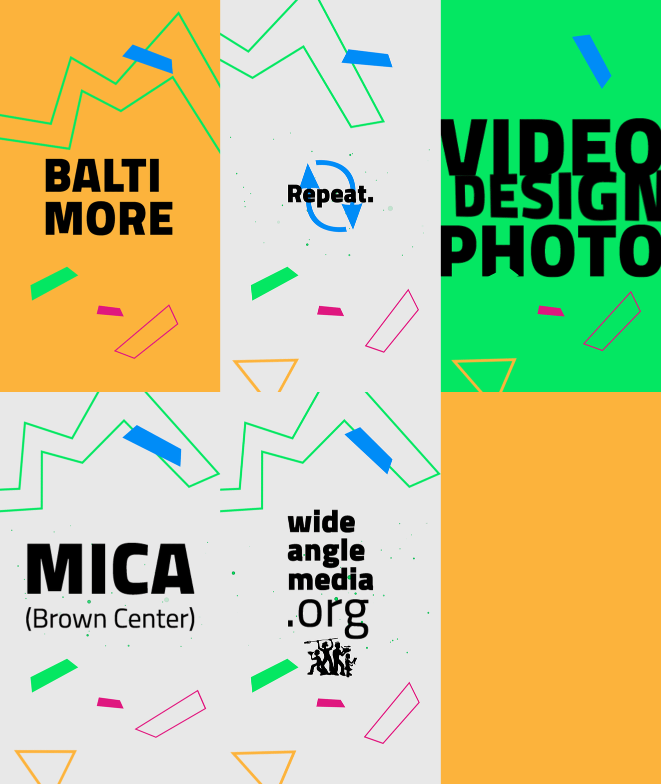
Event Identity: Wide Angle Youth Media Screening & Exhibition | Creative Direction, Design Research, Icon & Pattern Design, Print Design, Motion Graphics, Production Management, Mentorship, Naming, Editorial & Digital Design
Full identity system for a donor event, built from participant research into a 90s-inspired brand — icon and pattern design, a magazine-style program booklet, posters, invitations, and motion graphics. Led creative direction, mentored an apprentice designer, and managed production from concept through delivery.
Click to read the recap.


Logo & Brand Identity Package: Grasshopper Farms | Art Direction, Concept Development, Logo Illustration, Style Guides, Brand Writing, Brand Identity, Website Design Direction
Developed a complete brand identity — from logo and messaging to print collateral and investor pitch decks — to help a new cannabis farm launch with clarity and confidence in a crowded, competitive industry. I began by developing three distinct creative concepts, each presenting a different visual and verbal direction, and pitched them to the client to find the strongest fit for his vision. From there, I worked closely with him to define the brand's voice and messaging, translating his goals and personality into language and visuals that felt authentic rather than generic. Every piece — from the logo to the pitch deck — was crafted to give the brand a distinct voice from day one, positioning it to stand out to both investors and consumers in a market where most competitors look and sound the same.


Logo & Brand Identity Design: Kids' Camp | Brand Strategy, Creative Direction, Concept Development, Logo Design, Motion Graphics, Apparel Design, Print Design
Designed the logo, brand identity, motion graphics, t-shirts, and print collateral for a children's summer program, built for school-aged kids while parents were at work. The client's brief was straightforward: design for a daycare. But daycare wasn't the experience kids should walk away with — so I reframed the concept entirely, developing a visual identity that felt less like childcare and more like summer camp: playful, adventurous, and something kids would actually look forward to. That shift in perspective shaped every decision that followed, from a logo built for energy and fun to a full system of collateral, apparel, and motion graphics that made the program feel like an experience worth showing up for, not a place to be dropped off.


Packaging Design & Illustration: Dunkin' "Friend Day" Gift Card Series | Art Direction, Campaign Concept, Custom Illustration, Copywriting, Packaging Design, In-House Production, Vendor Coordination
As part of a church community outreach effort, I partnered with a local Dunkin' for their annual "Friend Day" giveaway — an event built around a simple invitation: bring a friend, or make a new one, and invite someone you've only just met to come along and be surprised with a small gift as a thank-you for showing up. I wanted that gesture to feel just as warm and intentional as the invitation itself, so I designed a custom illustrated gift card series to give it a personality of its own.
I owned the project start to finish — developing the concept, illustrations, and copy, then working directly with Dunkin's organization to procure bulk custom gift cards printed with our logo. From there, I printed, cut, and folded every card in-house, pairing hand-drawn illustrations of Dunkin' drinks and donuts with cheesy, pun-driven copy — like "You're One in a Dozen" — before packaging them, ready to hand out the morning of the event.
It wasn't just about the card itself; it was about making sure a first-time guest, maybe someone walking through the door not knowing a single face in the room, left holding something that felt like a genuine welcome rather than a formality.
It's a small project with a big personality — and a fitting note to close on: sometimes the most meaningful design work is the kind that makes a stranger feel like a friend before they've even said a word.
bottom of page